Explore the subcellular localization of proteins human T cells
We have curated a high resolution subcellular proteomic map of primary human T cells, divided into cytosolic, nuclear and membrane (including organelles) fractions under steady state conditions and upon 15 minutes and 1 hour of T cell receptor (TCR) stimulation respectively. We quantified the subcellular distribution of 7122 proteins and identified a subset of 210 potentially translocating proteins, including both well-known examples and novel ones. Microscopic validation confirmed the localization of selected proteins with previously known and unknown localization respectively.
Experimental Outline
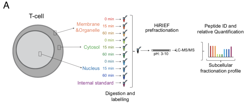
CD4+ T cells from 3 donors were stimulated for 15 min or 1 h with cross linked anti-CD3/anti-CD28 antibodies (TCR stimulation) or processed as untreated. The cells upon fractionation were analyzed in MS as represented in the workflow. The subcellular fractions and time points of activation are represented by individual colors.
Western Blot evaluation of subcellular fractionation
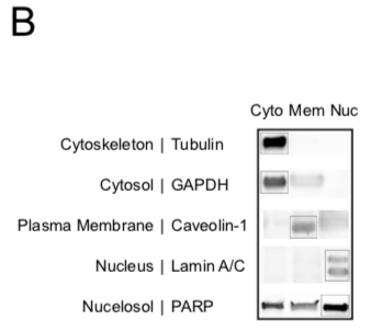
A representative immunoblot of the 3 subcellular components after fractionation probed with antibodies against markers of specific subcellular location as represented.
PCA all fractions and donors
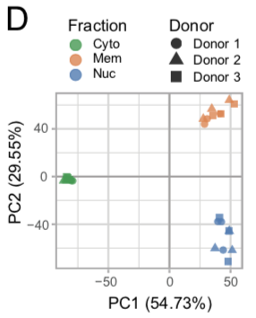
Principle Component Analysis was performed on the TMT intensity ratios of individual components and timepoints from each donor normalized to the internal standard. The fractions are represented by individual colors and the donors are represented by individual shapes.
Heat map all fractions and donors
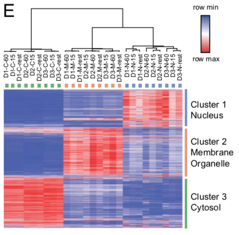
The heat map depicts log2 values of TMT intensity ratios and represented according to the indicated row normalized color scheme. The columns are clustered by average linkage method using 1 minus Pearson correlation. The rows are clustered by k means clustering (k=3) by 1 minus Pearson correlation. The clusters are represented in individual colors.